Understanding CSS Easing Functions
The modern web wouldn’t be what it is today without the many beautiful animations that make up modern websites. You’d be pressed to find a modern website, be it a personal project or corporate marketing page, without any animations. In fact, most of the time, every little detail from button hover effects to button presses, from scroll-in effects for text to entire backgrounds, is animated on the modern web. This article will show you all the options you have, help you understand them, and assist you in building your own.
Let’s take a look at an example of a button hover effect. You’d normally declare a change using the transition property, like this:
.my-el { transition: all 150ms ease;}But wait, what is that ease part all about? I’m pretty sure that if you’ve ever wanted to make some animation using CSS, you’ll have run into some problems when just applying the default animation with a duration and the linear property. It might’ve looked similar to this:
I think that animation can objectively be called “odd”. The way the ball moves, it’s to static, too robotic. And that is where CSS easing functions come into play.
A not so Ease-y topic
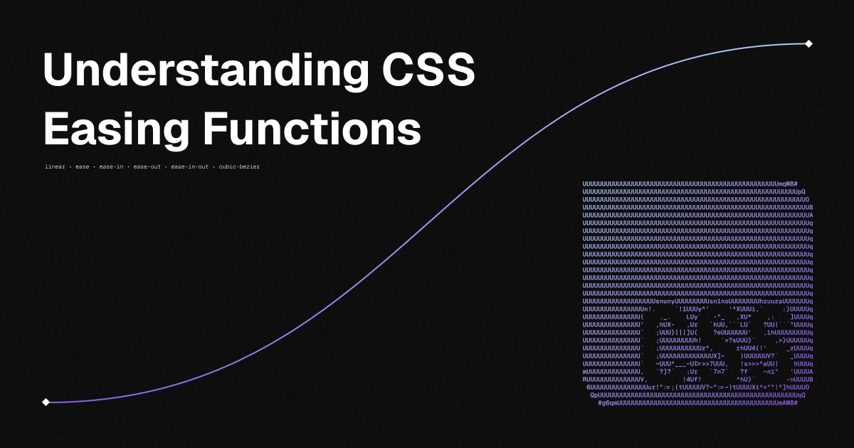
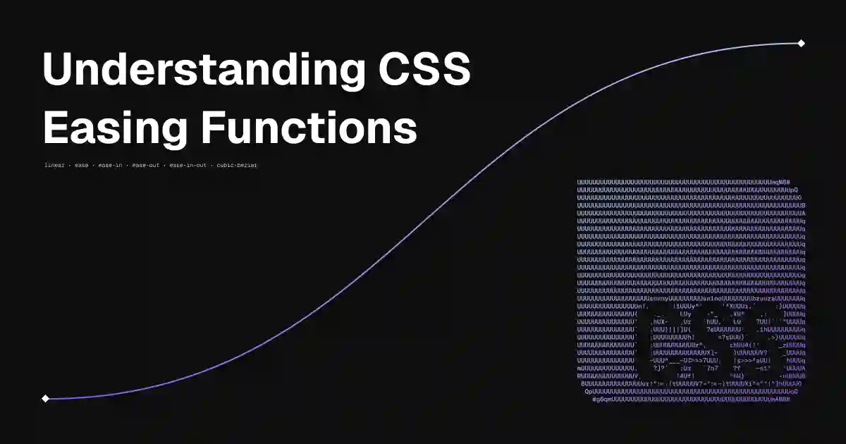
What even is an “easing function”? Well, they’re essentially just small mathematical curves that describe how a certain parameter changes over time. Usually, they’re defined from 0 - 1, making it easy to convert the current point on the x- or y-axis into a percentage. The “default” and easiest easing function is called “linear” and simply interpolates between zero and one, no curves involved. It’s also the one you’ve seen earlier. Here’s how that interpolation looks on a chart:
The graph on the left signifies the speed of the animation over a specified amount of time. The x-axis represents the time passed, while the y-axis represents the position of the item being animated. You can think of the tangent at any position on the curve being the speed at which the item moves.
The good news is that there’s a lot of other options at our disposal for not having our animations look as robotic as a Tesla Optimus. And contrary to those robots, you can use them right now at no additional cost!
The first example is the ease function. It offers a function that increases in velocity towards the middle of the transition, slowing back down at the end. This is my favorite transition to use for hover effects and the like, mostly due to it’s “ease” of use (pun intended):
You can see how, at the start of the animation, the item speeds up very quickly, before slowing down later on.
Time to Ease-In Further
While the normal ease function is fairly standard in what it does, it is still fairly basic - we can do better than that. Entry ease-in, a function that start off slow and speeds up towards the end:
I’ll try to provide a use-case for every animation on here in this blog post. Maybe ease-in could simulate a car or another object speeding up?
It’s counterpart, the ease-out function, does the opposite: it starts of fast, then slows down towards the end:
Just so I don’t have to bring up the car example again, this could be a train coming to a halt, or a fan being turned off.
And although we already have the ease function, there is also a mix of ease-in and ease-out: the ease-in-out function. It functions almost like a more aggressive version of ease:
Easing Even Further Beyond
So much for the built-in options. But you’ve probably seen stuff like a spring animation or even more aggressive easing. Luckily, CSS has a built-in cubic-bezier function that lets you define custom curves as you like. Let’s take a look at a spring-style animation as an example:
Here’s the code for this curve:
.my-el { transition-timing-function: cubic-bezier(0.68, -0.55, 0.265, 1.45);}Now is probably a good point to explain how the four parameters for this function work. Here’s the function with the parameter names, so it’s easier to wrap your head around:
cubic-bezier(x1, y1, x2, y2)The x1 and x2 parameters represent time on the x-axis and must be in the range of 0 to 1. y1 and y2 can be any real number, as they define how “fast” the animation feels. For example, here’s the linear function from earlier represented as a cubic bezier curve:
cubic-bezier(0, 0, 1.0, 1.0)Here’s another couple fun bezier curves! I call these two the “lightspeed” functions, because of the way the item just zips around:
cubic-bezier(1.0, 0, 1.0, 0)cubic-bezier(0, 1.0, 0, 1.0)There’s a lot of cool things you can do with these functions - you can look up some online or even make your own! Maybe this could be the final touch on your newest creation? If you want to have a go at creating some in a visual editor, take a look at epiceasing.com. You can play around with the curves and see changes in real-time!
Easing-out
I’ll stop with the ease wordplay now - thanks for reading the article! A bit of personal talk, my recent article about Astro Integrations blew up unexpectedly, reaching what I can only describe as a ridiculous amount of people. At the time of me writing this article, over 1000 people have seen the article, it was featured on This Week in React, Bytes, Astro Weekly and shared on Daily.dev (I don’t even know by who, thanks though)! “Internet fame” was not on my bucket list, but I’m very happy to see that so many people enjoyed reading my content, because that’s what I ultimately make these posts for: So other people can learn from my shenanigans.
In any case, I’ll allow my self one last easing joke and ease on out of here. Thanks for reading and until next time!
← Back to blog